Customize the catalog theme
Every story's canvas has a light/dark switch in its toolbar, letting you check how a component looks against both backgrounds without leaving the catalog.
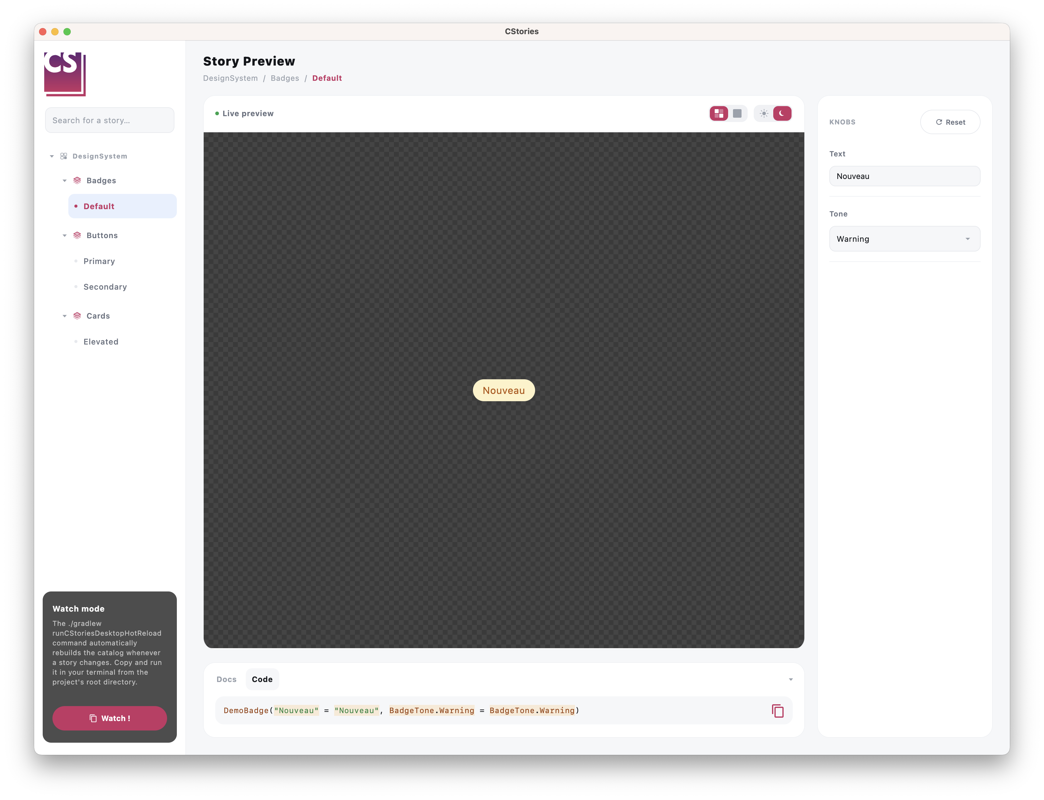
Default behavior
By default, toggling it wraps the previewed story in a plain Material3 MaterialTheme using
darkColorScheme()/lightColorScheme() — enough for components that already rely on MaterialTheme.colorScheme
for their colors.
Using your own theme
If your design system uses its own theme instead of Material3 (a MyTheme(isDark) { ... }, for example), define a
wrapper object:
import io.cstories.runtime.CStoriesThemeWrapper

object CustomCStoriesThemeWrapper : CStoriesThemeWrapper {
    @Composable
    override operator fun invoke(isDark: Boolean, content: @Composable () -> Unit) {
        MyTheme(isDark = isDark, content = content)
    }
}
The object is discovered automatically by the CStories plugin. No Gradle configuration is required. If the object is
not present, DefaultCStoriesThemeWrapper is used.
Override a story
A story can use another theme without changing the global catalog wrapper. First define an object that implements
CStoriesThemeWrapper. The object must implement invoke, which receives the selected light/dark state and must render
the story inside your theme:
object MyThemeWrapper : CStoriesThemeWrapper {
    @Composable
    override operator fun invoke(isDark: Boolean, content: @Composable () -> Unit) {
        MyTheme(isDark = isDark, content = content)
    }
}
Then reference that object from the story's themeWrapper argument:
@CStory(
    collection = "Components",
    group = "Buttons",
    name = "Alternative button",
    themeWrapper = MyThemeWrapper::class,
)
@Composable
fun AlternativeButtonStory() {
    AlternativeButton()
}
The story-specific wrapper takes priority over the wrapper passed to CStoriesApp. Stories without a
themeWrapper argument use the catalog wrapper, or DefaultCStoriesThemeWrapper when no global wrapper was discovered.
Device previews
When a story uses DevicePreview, MobileDevicePreview, or DesktopDevicePreview, the light/dark selection is applied
inside the simulated viewport. The phone or desktop window content is therefore rendered with the selected theme, while
the surrounding canvas keep the catalog UI theme.
@CStory(collection = "Screens", group = "Profile", name = "Responsive")
@Composable
fun ResponsiveProfileStory() {
    DevicePreview {
        ProfileScreen()
    }
}
For a direct MobileDevicePreview or DesktopDevicePreview, the same rule applies: only the content inside the
simulated device is wrapped by the selected theme.