Preview a story on mobile and desktop
DevicePreview lets you render the same story inside a simulated mobile device or desktop window. It is useful for
checking a responsive screen without creating separate stories for each target format.
import io.cstories.runtime.DevicePreview

@CStory(collection = "Screens", group = "Profile", name = "Responsive")
@Composable
fun ResponsiveProfileStory() {
    DevicePreview {
        ProfileScreen()
    }
}
Switch the preview format
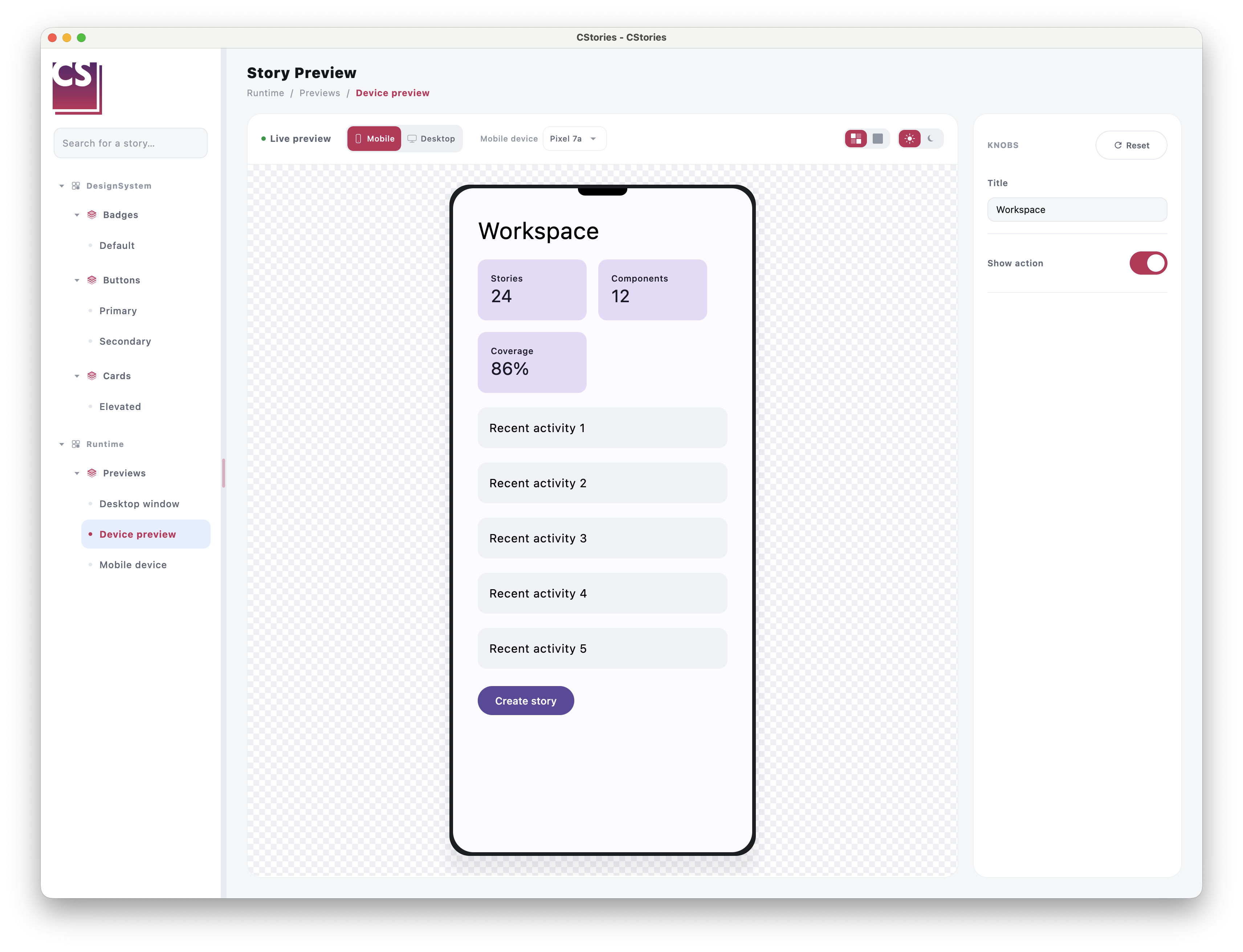
When a story containing DevicePreview is rendered in the CStories catalog, the catalog automatically adds a
Mobile/Desktop switch to the story toolbar, next to the live preview controls. The switch is only shown for stories
that use DevicePreview.
The selected format changes the viewport without changing the story content:
Mobilerenders the content insideMobileDevicePreview.Desktoprenders the content insideDesktopDevicePreview, including a simulated window title bar.
Outside the CStories catalog, DevicePreview renders the same switch above the preview so the component remains useful
in a standalone Compose screen.
Configure the initial format
The default format is mobile. Use initialDevice to open the story in desktop mode instead:
import io.cstories.runtime.DevicePreview
import io.cstories.runtime.PreviewDevice

DevicePreview(
    initialDevice = PreviewDevice.Desktop,
) {
    DashboardScreen()
}
PreviewDevice has two values:
PreviewDevice.MobilePreviewDevice.Desktop
Configure the simulated viewports
The mobile and desktop viewports can be configured independently:
import androidx.compose.ui.unit.dp
import io.cstories.runtime.DesktopDevice
import io.cstories.runtime.DevicePreview
import io.cstories.runtime.MobileDevice

DevicePreview(
    mobileDevice = MobileDevice(
        width = 390.dp,
        height = 844.dp,
    ),
    desktopDevice = DesktopDevice(
        width = 1280.dp,
        height = 800.dp,
        title = "Dashboard",
    ),
) {
    DashboardScreen()
}
The default dimensions are 390.dp x 844.dp for mobile and 1280.dp x 800.dp for desktop. Both previews scroll
vertically when their content is taller than the simulated viewport.
Use the built-in mobile catalog
The runtime ships a versioned JSON catalog of common mobile devices. It is used automatically by DevicePreview when
the mobile format is active, so no device configuration is required in a story.
The built-in catalog currently includes:
- iPhone SE (2nd generation), iPhone 13 through iPhone 18, and iPhone DUO;
- Pixel 7 through Pixel 10;
- Pixel
a,Pro,XL,Pro FoldandFoldvariants where available in the catalog.
The catalog is part of the CStories runtime and can evolve with new CStories versions.
Add devices in Kotlin
Projects can extend the built-in catalog with a Kotlin list. No JSON file is required in the consuming project:
import androidx.compose.ui.unit.dp
import io.cstories.runtime.DevicePreview
import io.cstories.runtime.MobileDevice

DevicePreview(
    additionalMobileDevices = listOf(
        MobileDevice(
            id = "company-phone",
            name = "Company Phone",
            width = 393.dp,
            height = 852.dp,
            cornerRadius = 34.dp,
        ),
    ),
) {
    DashboardScreen()
}
Additional devices are appended to the built-in catalog. If an additional device uses an existing id, it replaces the
built-in entry with that id.
Use the mobile preview directly
Use MobileDevicePreview when a story should always render as a mobile screen and does not need a format switch:
import io.cstories.runtime.MobileDevicePreview

MobileDevicePreview {
    ProfileScreen()
}
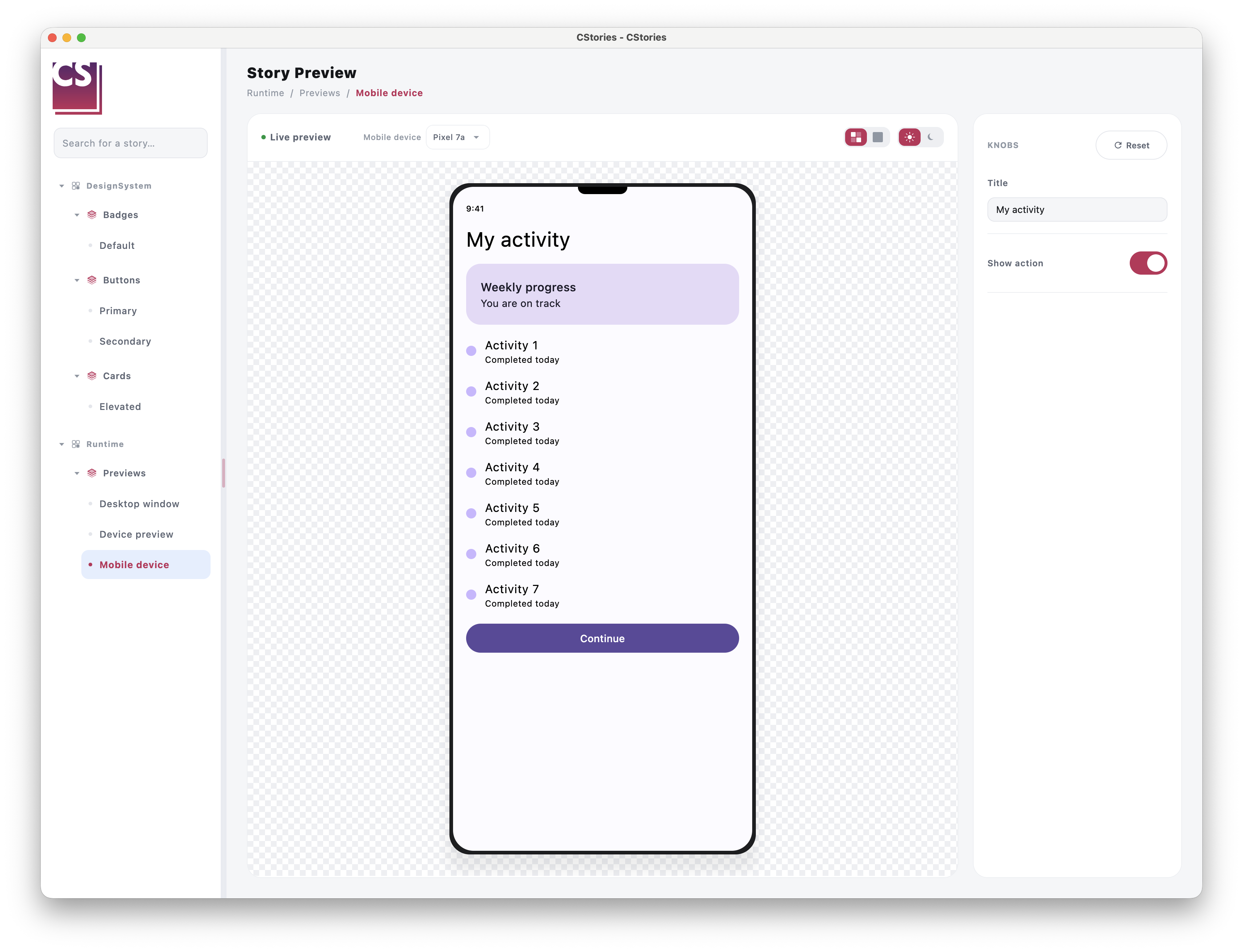
MobileDevicePreview renders a phone-shaped viewport with rounded corners, a device frame and a top camera cutout.
Its default size is 390.dp x 844.dp. Configure the device when another mobile format is useful:
import androidx.compose.ui.unit.dp
import io.cstories.runtime.MobileDevice
import io.cstories.runtime.MobileDevicePreview

MobileDevicePreview(
    device = MobileDevice(
        width = 375.dp,
        height = 812.dp,
        cornerRadius = 32.dp,
    ),
) {
    ProfileScreen()
}
The content scrolls vertically inside the simulated screen when it is taller than the viewport.
When MobileDevicePreview is used directly inside a catalog story, the story toolbar automatically shows the mobile
device selector. It displays the selected model and opens the built-in device catalog, without showing the
Mobile/Desktop switch because the story is already fixed to the mobile format.
@CStory(collection = "Screens", group = "Profile", name = "Mobile")
@Composable
fun MobileProfileStory() {
    MobileDevicePreview {
        ProfileScreen()
    }
}
To add project-specific devices to this selector, pass them with additionalMobileDevices:
MobileDevicePreview(
    additionalMobileDevices = listOf(
        MobileDevice(
            id = "company-phone",
            name = "Company Phone",
            width = 393.dp,
            height = 852.dp,
        ),
    ),
) {
    ProfileScreen()
}
Use the desktop preview directly
Use DesktopDevicePreview when a story should always render as a desktop window and does not need a format switch:
import io.cstories.runtime.DesktopDevicePreview

DesktopDevicePreview {
    DashboardScreen()
}
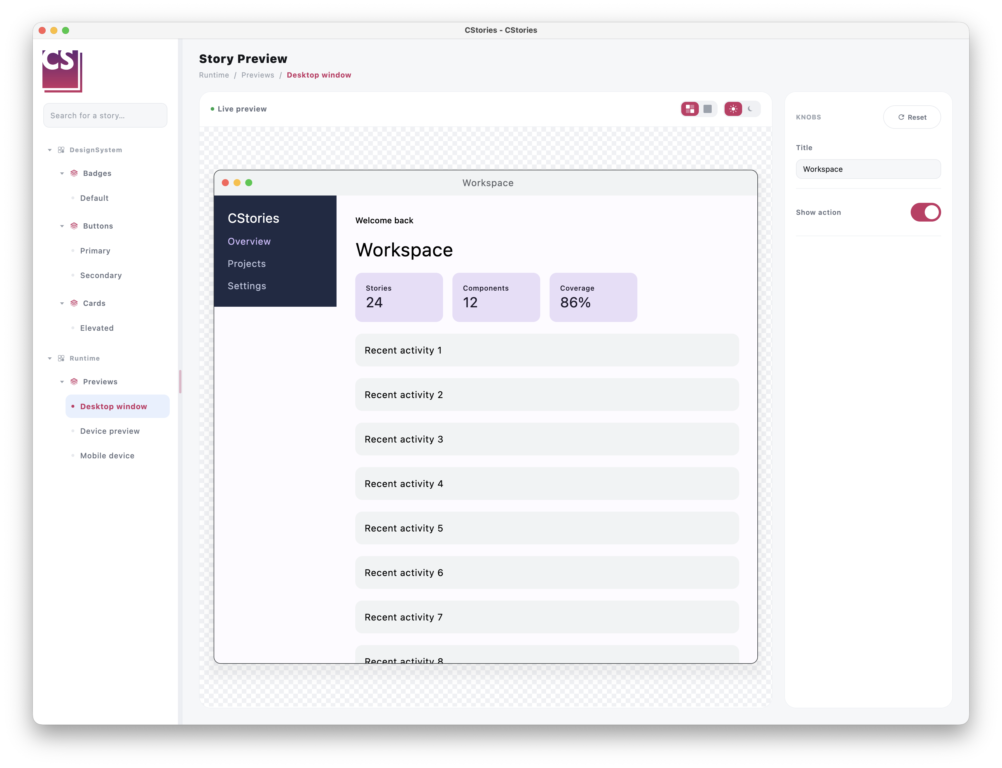
DesktopDevicePreview renders a desktop window with a title bar, decorative window controls and a scrollable content
viewport. Its default size is 1280.dp x 800.dp. Configure the window size and title when needed:
import androidx.compose.ui.unit.dp
import io.cstories.runtime.DesktopDevice
import io.cstories.runtime.DesktopDevicePreview

DesktopDevicePreview(
    device = DesktopDevice(
        width = 1440.dp,
        height = 900.dp,
        title = "Analytics",
    ),
) {
    DashboardScreen()
}
The window controls are decorative only. They do not resize or close the native CStories application window.
React to format changes
Use onDeviceChanged when the story needs to observe the active format:
var activeDevice by remember { mutableStateOf(PreviewDevice.Mobile) }

DevicePreview(
    onDeviceChanged = { activeDevice = it },
) {
    DashboardScreen()
}

Text("Previewing: ${activeDevice.name}")
The callback is invoked once with initialDevice and again whenever the user selects a different format. It is not
invoked when the user selects the already active format.
Keep one device preview per story
A story should normally contain a single DevicePreview. The catalog toolbar exposes one Mobile/Desktop switch per
story, so multiple instances would share the same toolbar control ambiguously.