Add controls to a story
Stories become much more useful when they let you explore a component's states interactively. CStories provides a
small set of knobs for this, declared inside a KnobPanel.
KnobPanel
KnobPanel declares the controls for a story. Call it from within a @CStory composable, alongside the actual
preview:
@CStory(collection = "DesignSystem", group = "Buttons", name = "Primary")
@Composable
fun PrimaryButtonStory() {
    var label by remember { mutableStateOf("Click me") }

    KnobPanel {
        TextKnob(label = "Label", value = label, onValueChange = { label = it })
    }

    PrimaryButton(text = label, onClick = {})
}
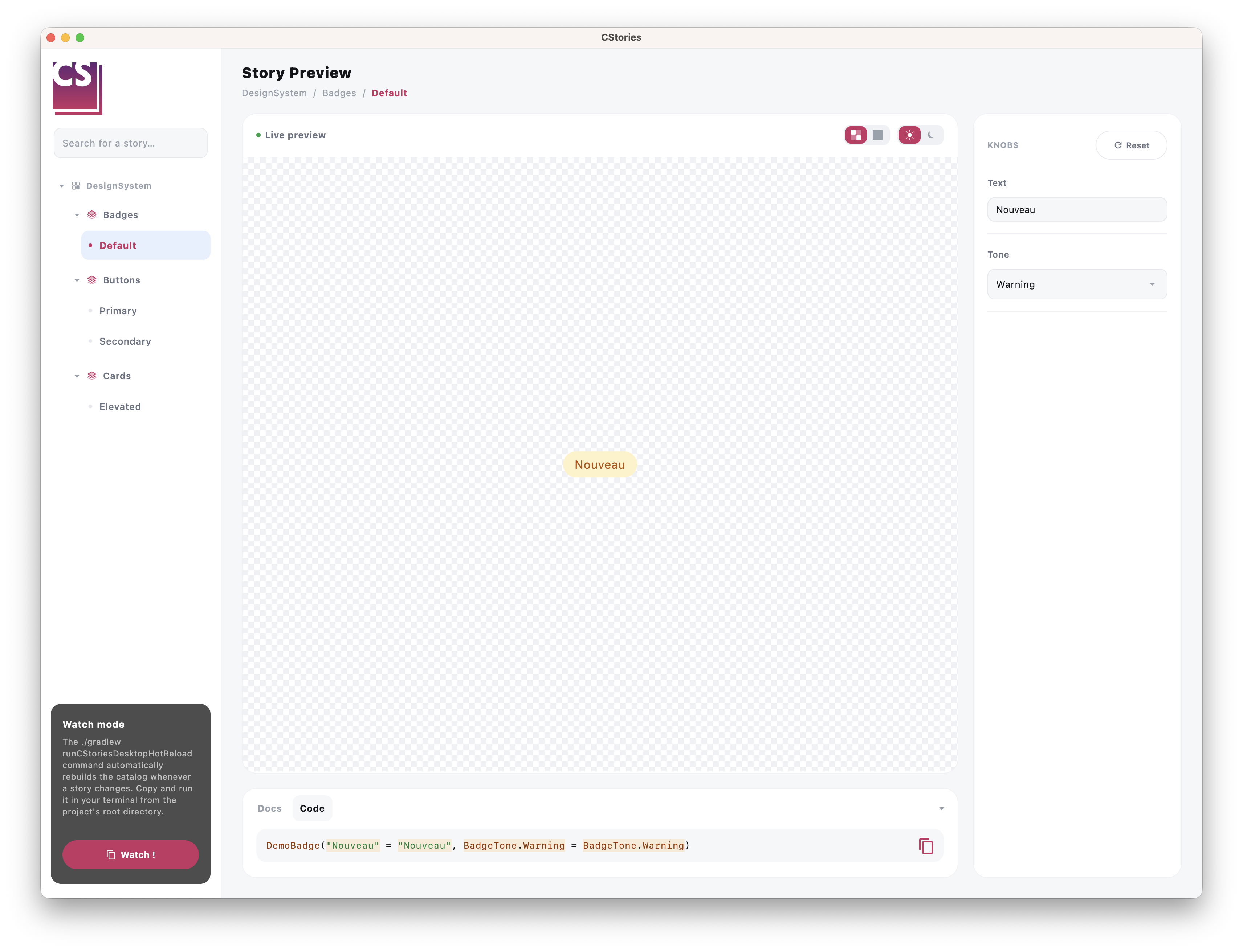
When rendered inside the catalog, this content is transparently moved into the runtime's dedicated controls panel, so the canvas only ever shows the story's actual preview.
TextKnob
A free-text input, for props that take an arbitrary string:
var label by remember { mutableStateOf("Click me") }

KnobPanel {
    TextKnob(
        label = "Label",
        value = label,
        onValueChange = { label = it },
        codeKey = "label",
    )
}
BooleanKnob
A toggle, for props that take a Boolean:
var enabled by remember { mutableStateOf(true) }

KnobPanel {
    BooleanKnob(
        label = "Enabled",
        value = enabled,
        onValueChange = { enabled = it },
        codeKey = "enabled",
    )
}
SelectKnob
A dropdown/select-style knob, for props that take one value out of a fixed set of options.
With a list of strings
var tone by remember { mutableStateOf("Success") }

KnobPanel {
    SelectKnob(
        label = "Tone",
        value = tone,
        options = listOf("Success", "Warning", "Danger"),
        onValueChange = { tone = it },
        codeKey = "tone",
    )
}
With an enum
When the prop is backed by an enum, prefer the enum-typed overload: it derives the list of options from
enumValues<T>() automatically, so you never need to keep the option list in sync by hand.
var tone by remember { mutableStateOf(BadgeTone.Success) }

KnobPanel {
    SelectKnob(
        label = "Tone",
        value = tone,
        onValueChange = { tone = it },
        codeKey = "tone",
    )
}

DemoBadge(text = "New", tone = tone)
About codeKey
codeKey connects a knob's current value to the story's generated "Code" tab: whenever you change a knob, the code
snippet shown in the catalog updates to reflect the new value. For the enum overload, this automatically renders the
fully-qualified constant (e.g. BadgeTone.Success) instead of a quoted string, so the snippet stays valid Kotlin
without any extra work on your part.
Best practices
- expose knobs for the props that actually matter for exploring the component's states
- keep a story focused: a handful of well-chosen knobs beats a dozen of everything
- prefer the enum-typed
SelectKnoboverload whenever the prop is backed by an enum