Document a component
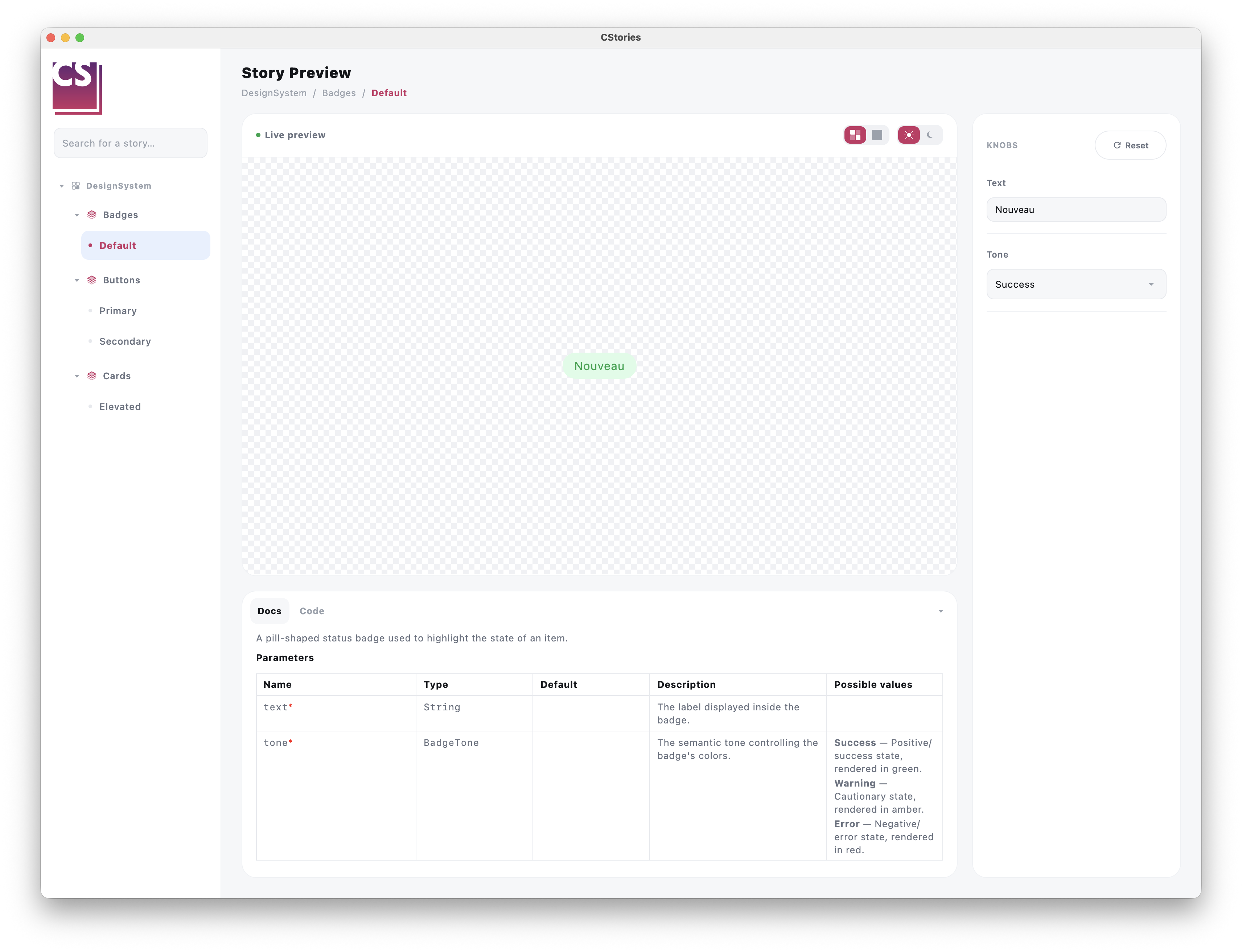
When a component is annotated with @CStoryComponent, its KDoc becomes the source of truth for the catalog's
documentation panel — no separate documentation to maintain.
Writing useful KDoc
/**
 * High-emphasis filled button, used for the main call-to-action.
 *
 * @param text Label displayed inside the button.
 * @param onClick Called when the button is clicked.
 */
@CStoryComponent
@Composable
fun PrimaryButton(text: String, onClick: () -> Unit) { /* ... */ }
The description and the @param tags are picked up and rendered in the story's documentation panel, next to the
live preview.
Best practices
- describe the component's intent, not just what it renders
- document parameters that actually influence behavior or appearance
- keep the description short — the documentation panel favors clarity over exhaustiveness
Across module boundaries
When a component lives in a different module than the story that demonstrates it (the :lib / :lib:stories
split), the KDoc still needs to reach the catalog even though :lib:stories never sees :lib's source directly.
This works transparently: the resolved KDoc gets pre-rendered to Markdown and embedded as an annotation on the
matching CStoryComponentRefs property (annotations survive compilation, unlike KDoc comments), so the story's
module can read it back without needing access to the component's source. As a component author, you don't need to
do anything differently — writing the KDoc on the @CStoryComponent function is all that's required.