Customize the catalog theme
Every story's canvas has a light/dark switch in its toolbar, letting you check how a component looks against both backgrounds without leaving the catalog.
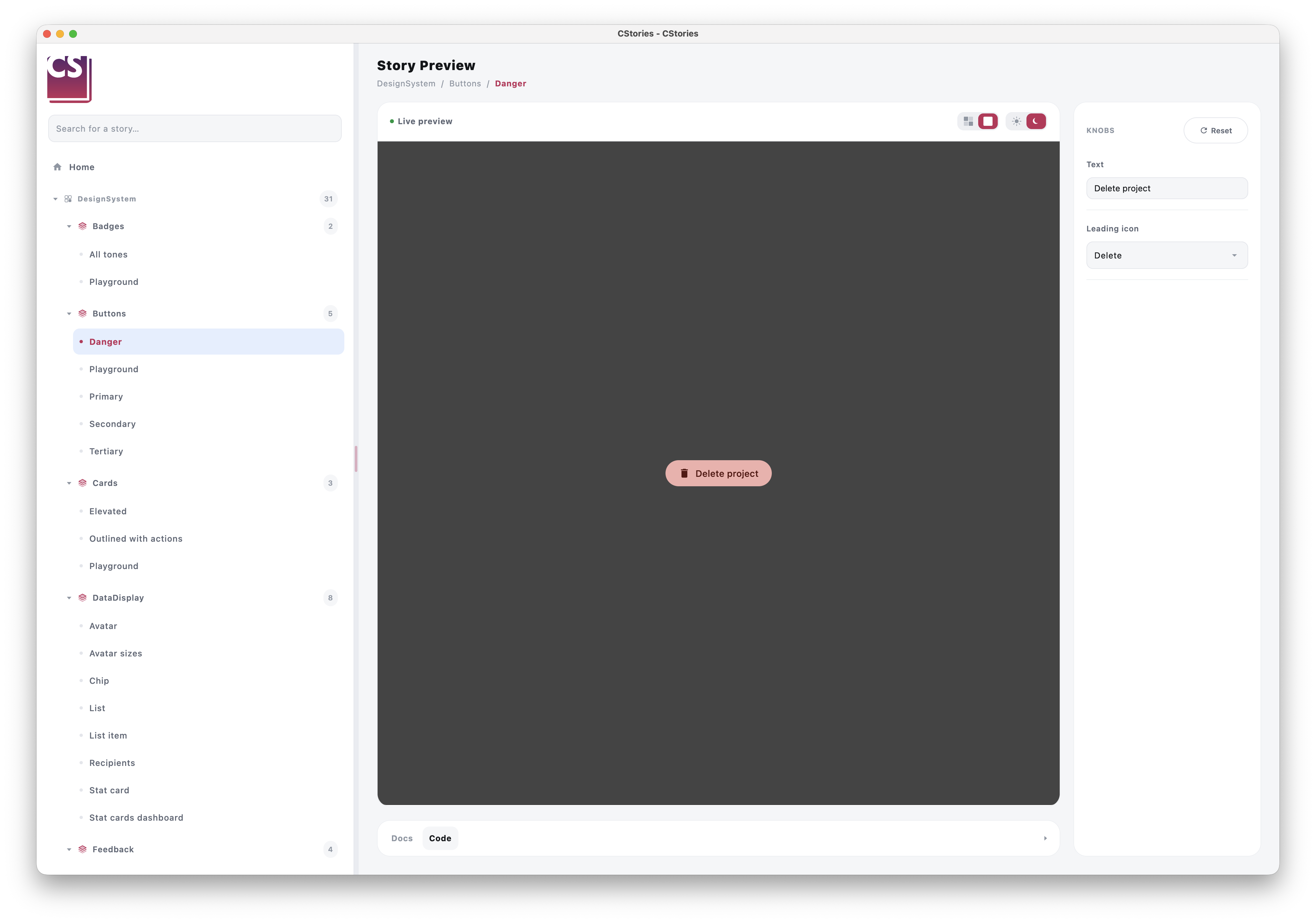
Default behavior
By default, toggling it wraps the previewed story in a plain Material3 MaterialTheme using
darkColorScheme()/lightColorScheme() — enough for components that already rely on MaterialTheme.colorScheme
for their colors.
Using your own theme
If your design system uses its own theme instead of Material3 (a MyTheme(isDark) { ... }, for example), define a
wrapper object:
import io.cstories.runtime.CStoriesThemeWrapper

object CustomCStoriesThemeWrapper : CStoriesThemeWrapper {
    @Composable
    override operator fun invoke(isDark: Boolean, content: @Composable () -> Unit) {
        MyTheme(isDark = isDark, content = content)
    }
}
The object is discovered automatically by the CStories plugin, by name only. No Gradle configuration is required.
The global wrapper must be named exactly CustomCStoriesThemeWrapper. Any other name is ignored and
DefaultCStoriesThemeWrapper is used instead. It must also:
- be a top-level
object, notprivate; - implement
CStoriesThemeWrapper; - be unique in the module (declaring several fails the build).
If the object is not present, DefaultCStoriesThemeWrapper is used.
Override a story
A story can use another theme without changing the global catalog wrapper. First define an object that implements
CStoriesThemeWrapper. The object must implement invoke, which receives the selected light/dark state and must render
the story inside your theme:
object MyThemeWrapper : CStoriesThemeWrapper {
    @Composable
    override operator fun invoke(isDark: Boolean, content: @Composable () -> Unit) {
        MyTheme(isDark = isDark, content = content)
    }
}
Then reference that object from the story's themeWrapper argument:
@CStory(
    collection = "Components",
    group = "Buttons",
    name = "Alternative button",
    themeWrapper = MyThemeWrapper::class,
)
@Composable
fun AlternativeButtonStory() {
    AlternativeButton()
}
The story-specific wrapper takes priority over the wrapper passed to CStoriesApp. Stories without a
themeWrapper argument use the catalog wrapper, or DefaultCStoriesThemeWrapper when no global wrapper was discovered.
Device previews
When a story uses DevicePreview, MobileDevicePreview, or DesktopDevicePreview, the light/dark selection is applied
inside the simulated viewport. The phone or desktop window content is therefore rendered with the selected theme, while
the surrounding canvas keep the catalog UI theme.
@CStory(collection = "Screens", group = "Profile", name = "Responsive")
@Composable
fun ResponsiveProfileStory() {
    DevicePreview {
        ProfileScreen()
    }
}
For a direct MobileDevicePreview or DesktopDevicePreview, the same rule applies: only the content inside the
simulated device is wrapped by the selected theme.