Home page
The catalog opens on a home page that gives an overview of every component in the library. You can come back to it at any time with the Home entry at the top of the sidebar, or by clicking the logo.
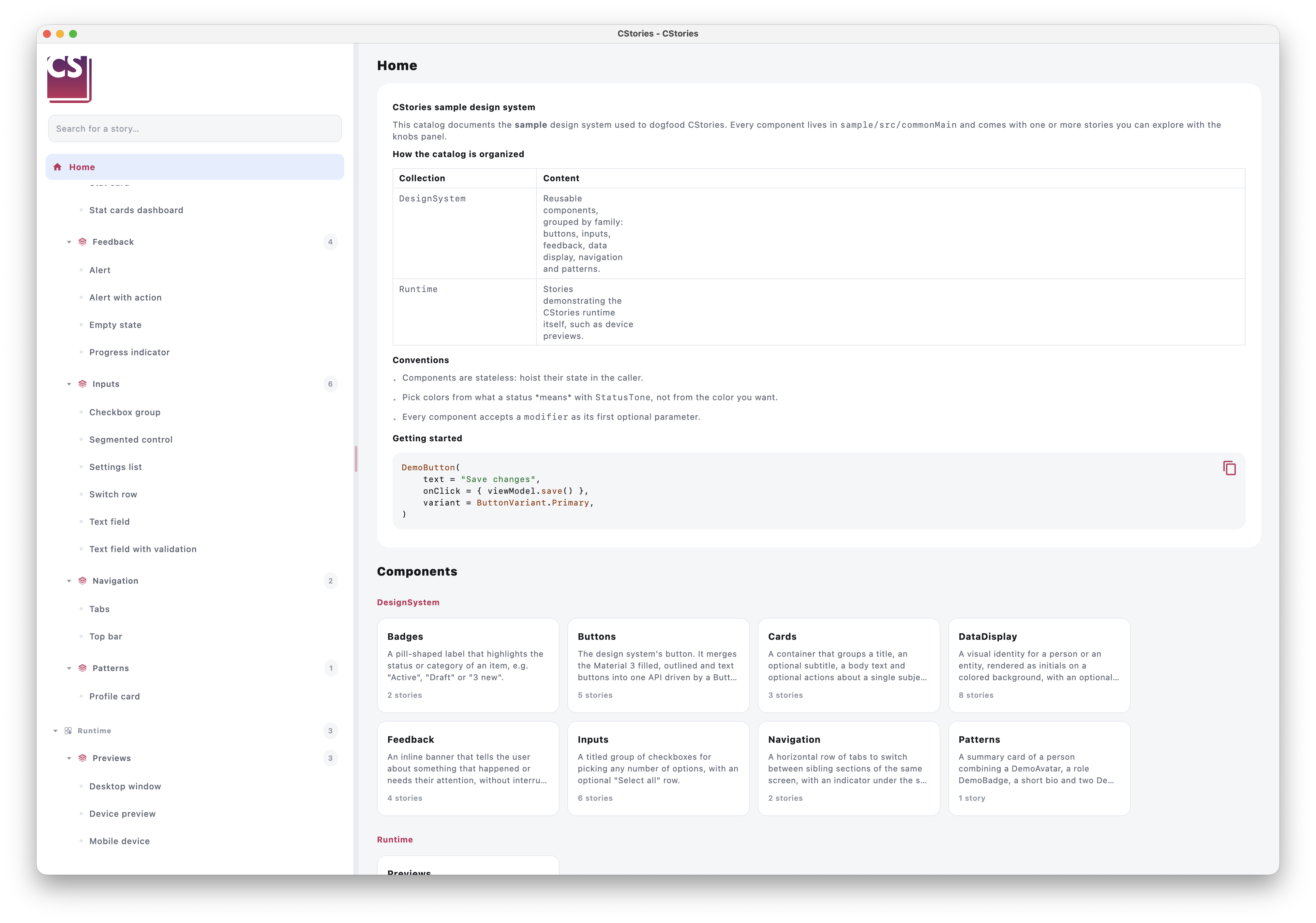
What the home page shows
- The content of an optional
CSTORIES.mdfile, rendered as Markdown (see below). - The list of components, organized in sections that follow the sidebar tree. Each group of stories (the level right
above the stories, for example
Buttons) becomes a card showing:- the name of the group;
- a summary, taken from the first paragraph of the documentation of the referenced component;
- the number of stories in the group.
Clicking a card opens the first story of the group. The sidebar search field also filters the home page.
Write a short first paragraph in the KDoc of your @CStoryComponent functions: it is the summary shown on the home
page. See Document a component.
Add an introduction with CSTORIES.md
Create a CSTORIES.md file at the root of the module that applies dev.cstories.gradle (next to its
build.gradle.kts):
lib/stories/
├── build.gradle.kts
├── CSTORIES.md
└── src/
Its content is displayed at the top of the home page. It supports the same Markdown as the component documentation: headings, lists, tables, bold, inline code and fenced code blocks (with a copy button).
# CStories design system

The CStories design system gathers the Compose components shared by our applications.

## Conventions

- Components are stateless: hoist their state in the caller.
- Every component accepts a `modifier` parameter.
The file is optional: without it, the home page only shows the list of components. The file name is fixed and is read when the catalog is built, so editing it is picked up by the next build, including in watch mode.