Add controls to a story
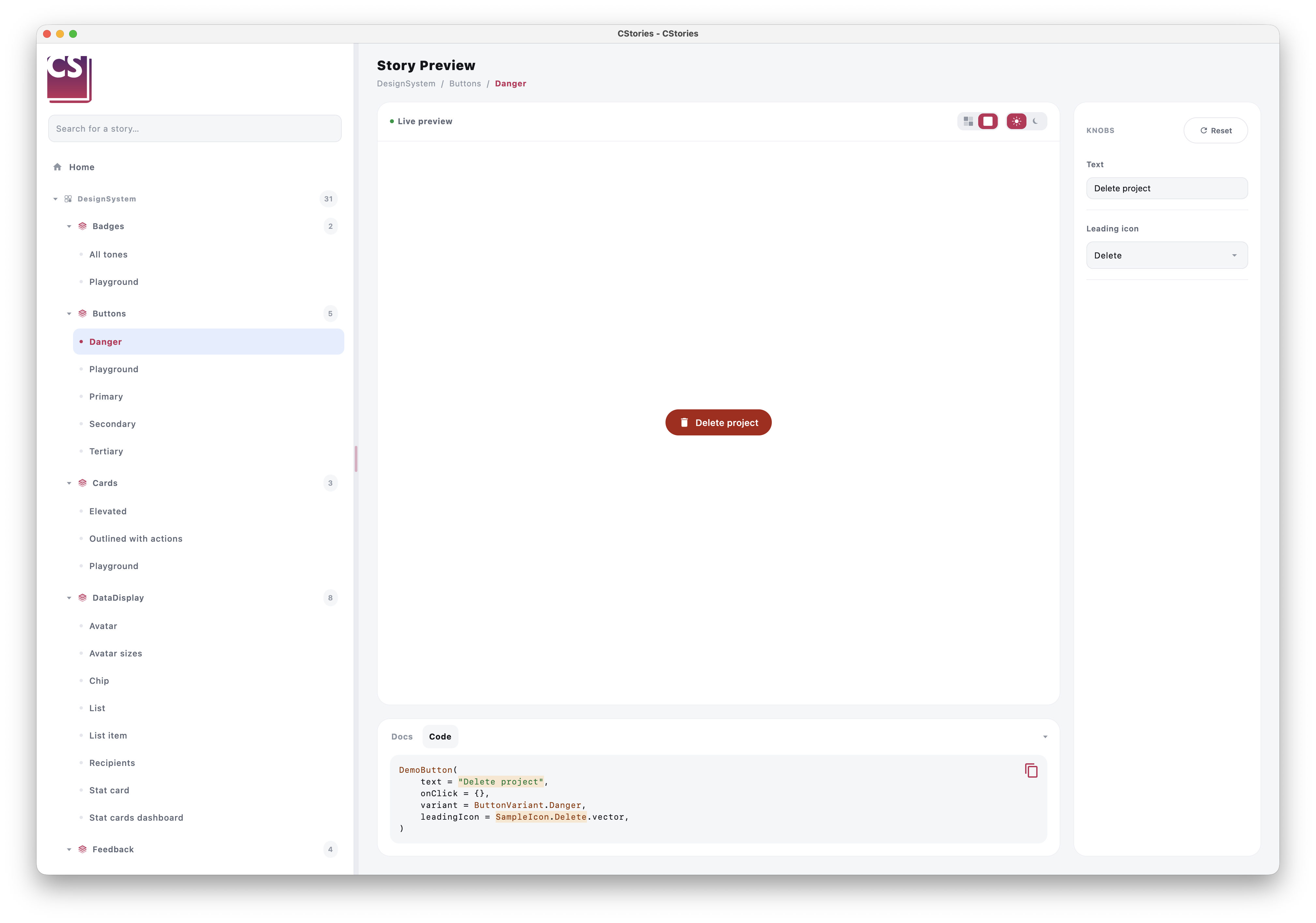
Stories become much more useful when they let you explore a component's states interactively. CStories provides a
small set of knobs for this, declared inside a KnobPanel.
KnobPanel
KnobPanel declares the controls for a story. Call it from within a @CStory composable, alongside the actual
preview:
@CStory(collection = "DesignSystem", group = "Buttons", name = "Primary")
@Composable
fun PrimaryButtonStory() {
    var label by remember { mutableStateOf("Click me") }

    KnobPanel {
        TextKnob(label = "Label", value = label, onValueChange = { label = it })
    }

    PrimaryButton(text = label, onClick = {})
}
When rendered inside the catalog, this content is transparently moved into the runtime's dedicated controls panel, so the canvas only ever shows the story's actual preview.
TextKnob
A free-text input, for props that take an arbitrary string:
var label by remember { mutableStateOf("Click me") }

KnobPanel {
    TextKnob(
        label = "Label",
        value = label,
        onValueChange = { label = it },
        codeKey = "label",
    )
}
BooleanKnob
A toggle, for props that take a Boolean:
var enabled by remember { mutableStateOf(true) }

KnobPanel {
    BooleanKnob(
        label = "Enabled",
        value = enabled,
        onValueChange = { enabled = it },
        codeKey = "enabled",
    )
}
IntKnob
A slider, for props that take an Int within a known range (a progress, a width, a number of items...):
var progress by remember { mutableStateOf(40) }

KnobPanel {
    IntKnob(
        label = "Progress (%)",
        value = progress,
        onValueChange = { progress = it },
        range = 0..100,
        step = 5,
        codeKey = "progress",
    )
}
rangesets the minimum and maximum values (both included).step(default1) makes the slider snap torange.first,range.first + step, and so on. If the range is not a multiple ofstep, the last reachable value is the highest one that fits.- The current value is displayed next to the label, and
codeKeysubstitutes it as anIntliteral in the "Code" tab.
SelectKnob
A dropdown/select-style knob, for props that take one value out of a fixed set of options.
With a list of strings
var tone by remember { mutableStateOf("Success") }

KnobPanel {
    SelectKnob(
        label = "Tone",
        value = tone,
        options = listOf("Success", "Warning", "Danger"),
        onValueChange = { tone = it },
        codeKey = "tone",
    )
}
With an enum
When the prop is backed by an enum, prefer the enum-typed overload: it derives the list of options from
enumValues<T>() automatically, so you never need to keep the option list in sync by hand.
var tone by remember { mutableStateOf(BadgeTone.Success) }

KnobPanel {
    SelectKnob(
        label = "Tone",
        value = tone,
        onValueChange = { tone = it },
        codeKey = "tone",
    )
}

DemoBadge(text = "New", tone = tone)
About codeKey
codeKey connects a knob's current value to the story's generated "Code" tab: whenever you change a knob, the code
snippet shown in the catalog updates to reflect the new value. For the enum overload, this automatically renders the
fully-qualified constant (e.g. BadgeTone.Success) instead of a quoted string, so the snippet stays valid Kotlin
without any extra work on your part.
The "Code" tab shows every call to the story's component found in the story body, in source order and separated by a
blank line. The surrounding code (layouts, loops, knob declarations) is not included.
Best practices
- expose knobs for the props that actually matter for exploring the component's states
- keep a story focused: a handful of well-chosen knobs beats a dozen of everything
- prefer the enum-typed
SelectKnoboverload whenever the prop is backed by an enum - use
IntKnobfor numeric props with a bounded range rather than aTextKnobthat has to be parsed